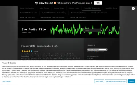

The page is an alphabetical list of links to archives of Foobar2000 components collected by The Audio File. It states the list includes developmental, experimental, problematic, untested and unsupported components, many developed for older Foobar versions, and that using old or unsupported components is not recommended for normal use.
Directory
Search results
Published directory entries matching your search.
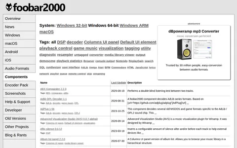
The foobar2000 Components Repository lists add-on components for the foobar2000 audio player, with systems, tags and per-component notes. Entries include decoders, DSPs, visualisations, output and interface panels, such as ABX Comparator, AdPlug, Album list panel and ASIO Output. A component detail page describes Feature Watcher, which watches available features and reports changes.
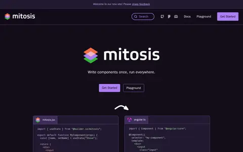
Mitosis is an open-source tool that transforms JSX components into functional components for frameworks such as Angular, React, Qwik, Vue, Svelte, Solid, and React Native. Writing UI components once in JSX allows them to be deployed across platforms without rewriting code for each framework. It also integrates with Figma to sync design systems to code and can generate Lit, Stencil, and raw web components.

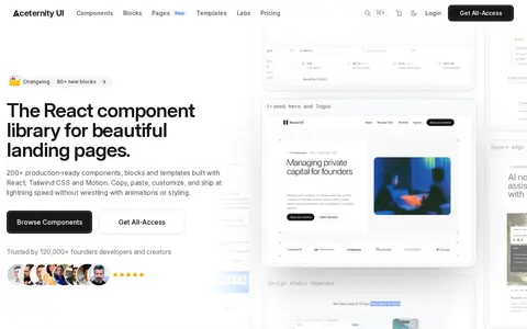
Aceternity UI is a React component library with over 200 copy-paste components, blocks, and landing page templates built with Tailwind CSS and Motion. It provides animated components for React and Next.js and ready-made UI blocks for landing pages. An AI agent can also be used to build with it.
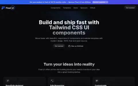
Float UI provides responsive website templates and UI components for React, Vue, Svelte and HTML built with Tailwind CSS. It describes the components as free and open-source and as copy-and-paste ready, alongside professional templates built on React and Next.js with Tailwind CSS.
UI Components is a developer resource for coding, documentation, communities, security research, or software tools.
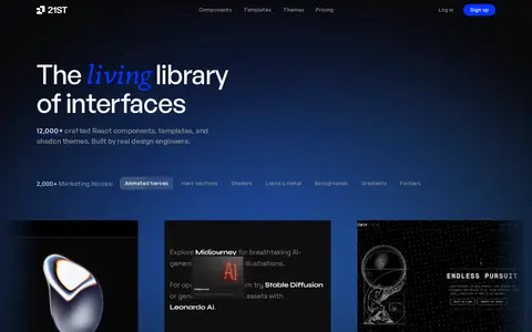
A community catalog of user interface resources built by design engineers, including React components, templates, shadcn themes, shaders and gradients. Components are indexed and searchable, can be previewed live, and ship as AI-ready prompts for tools such as Cursor, Claude Code and Lovable. Every component has an author.
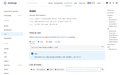
Ant Design is a frontend design resource for CSS frameworks, UI components, and web interfaces.
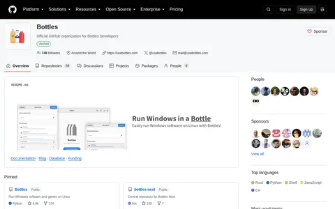
Bottlesdevs is the official GitHub organization for Bottles Developers. One pinned repository, Bottles, is described as running Windows software and games on Linux. The organization also hosts repositories for programs installation, components, wine software dependencies, and Bottles Next, including its core library and dependency registry server. Separate maintainer documentation covers dependencies, installers, and components maintainers.
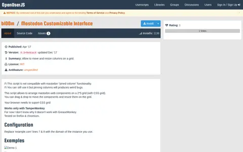
Mastodon Customizable Interface is a userscript for arranging Mastodon web components on a 2*5 grid using CSS grid, with drag-and-drop to move components and resizing on the grid. It requires browser support for CSS grid and works only with TamperMonkey. The script is not compatible with Mastodon pinned column functionality, and pinning columns produces bugs. Users replace example.com in lines 7 and 8 with their instance domain.
Tailwind CSS component library offering themes, UI components, and faster interface building.
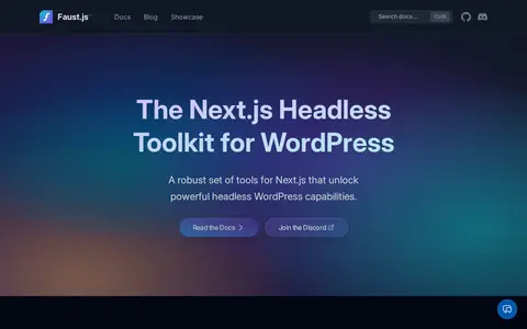
Faust.js is a set of tools for building headless WordPress applications with Next.js. It provides authentication, post previews, template hierarchy support and block components that map WordPress block editor blocks to Next.js components.
FreebiesUI is a frontend design resource for CSS frameworks, UI components, and web interfaces.
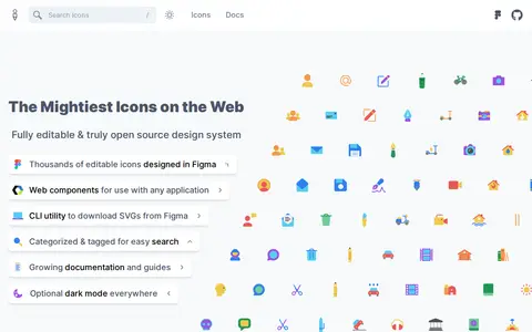
Glyphs is an open source icon design system for creating icon sets in Figma and using them on the web. It offers thousands of editable icons designed in Figma, web components for any application, and a CLI utility to download SVGs from Figma. Icons are categorized and tagged for easy search, with growing documentation and guides.
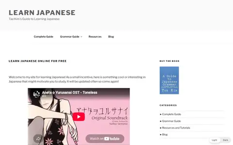
GuideToJapanese is a frontend design resource for CSS frameworks, UI components, and web interfaces.
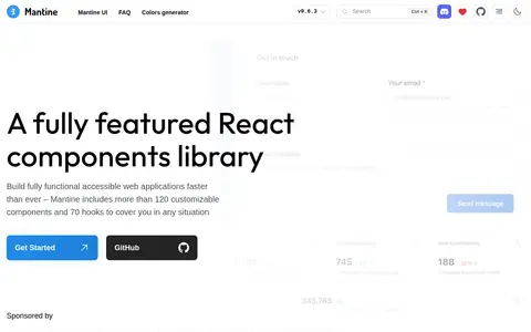
Mantine is a React components library with more than 120 customizable components and 70 hooks, focused on usability, accessibility and developer experience, with native dark theme support. It also provides LLM-optimized documentation, skills for AI agents and an MCP server for AI coding tools.
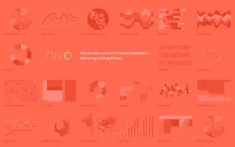
Nivo is a library of React data visualization components built on top of D3 and React. It provides a range of dataviz components including chord diagrams, line charts, bar charts, pie charts, choropleth maps and other visualization types.
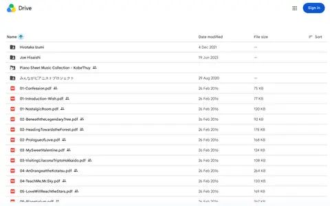
Piano Sheet Music is a frontend design resource for CSS frameworks, UI components, and web interfaces.
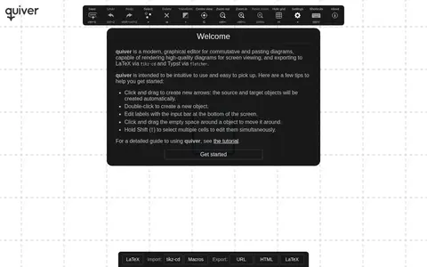
Quiver is a frontend design resource for CSS frameworks, UI components, and web interfaces.
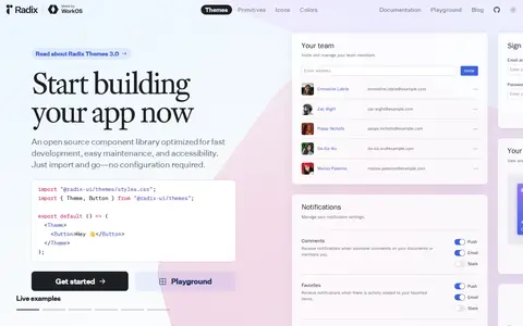
Radix UI provides components, icons and colors for building accessible user interfaces, described as free and open-source. Radix Themes is a pre-styled component library intended to work out of the box with minimal configuration, installed via the @radix-ui/themes package. Unstyled components are offered separately as Radix Primitives.
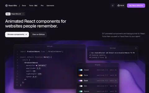
React Bits offers free, open source React components for animated text, backgrounds, interactive cards and micro interactions. Components install as source the developer owns, and the library provides live demos with copyable source. Developers can choose JavaScript or TypeScript with plain CSS or Tailwind, and copy the source or install a component with the CLI.
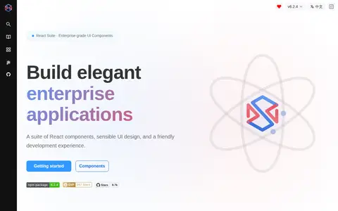
React Suite is a suite of React components for building enterprise applications. It features 80+ components, responsive design, dark mode, internationalization, accessibility support, and TypeScript-ready code, and is free and open source. It can be installed with npm and used across frameworks including Next.js, Vite and Create React App.
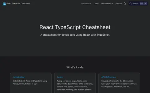
The React TypeScript Cheatsheet is a cheatsheet for developers using React with TypeScript. It provides an introduction, guidance on typing component props, hooks, class components, defaultProps, forms and events, context, refs, portals, error boundaries, concurrent rendering, and reusable patterns, plus API references for @types/react types such as ComponentProps, CSSProperties, ReactNode, and Ref.
shadcn-svelte provides composable, accessible components with thoughtful defaults, intended for building a custom component library with code that can be customized and extended. It offers a library of components, and a changelog notes the release of Trace, Code Block and AI Elements.